MENU
BOKA Design
9 Tips for Making Badass Graphics
August 9, 2022
What makes a great graphic? I believe a great graphic is one that has an impact, shares a vibe, or gets important information across. Graphics are used for adds, posters, info graphics, social media and a million other things. The quickest way for your brand to look cool and badass online is a great graphic and the quickest way to look unprofessional is a poorly designed graphic.
That’s why I’m sharing these tips with you. I don’t want your brand to be held back by something as simple as unprofessional graphic design. It’s not as hard as you might think to make BADASS graphics. Here are 9 tips for making badass graphics.
One. USE MARGINS
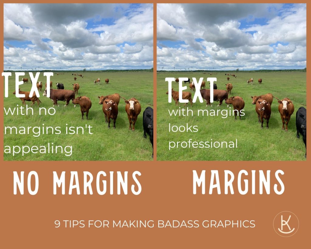
If your text touches the edges. STOP. Fix that now. Text that runs all the way to the edge of the page appears unprofessional. It’s usually preferable to have similar sized margins throughout an entire document or graphic.
Two. NO PIXELATED PICTURES
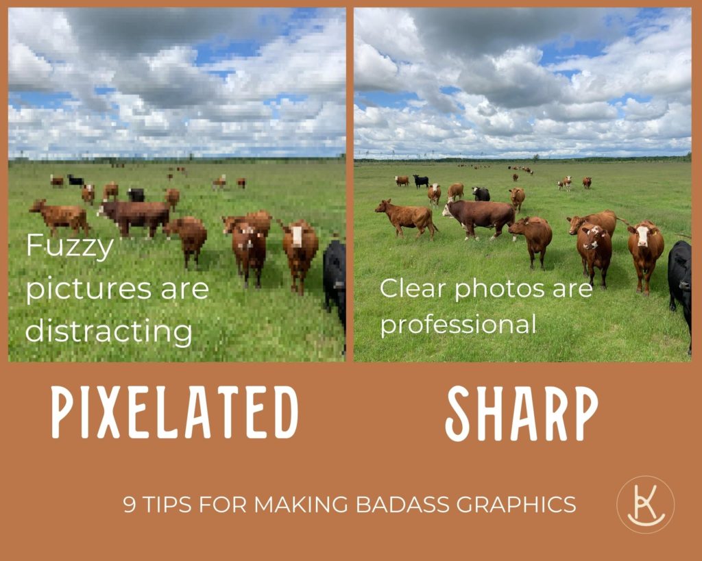
Just say no to fuzzy pictures. If you are anything like me there are some pictures that you love but sadly they were a bit grainy. It’s tempting to use them but rather save them for your personal photo book. Your customers will never have the same attachment to that photo as you do. The first thing they will notice is that it’s fuzzy.
If you request a photo from a collaborator and they send you a fuzzy photo don’t just use it, request a new one or request that they send it in a different format or on a different platform. Clear photos make everyone involved look more professional.
Three. LESS WORDS IS MORE MEMORABLE
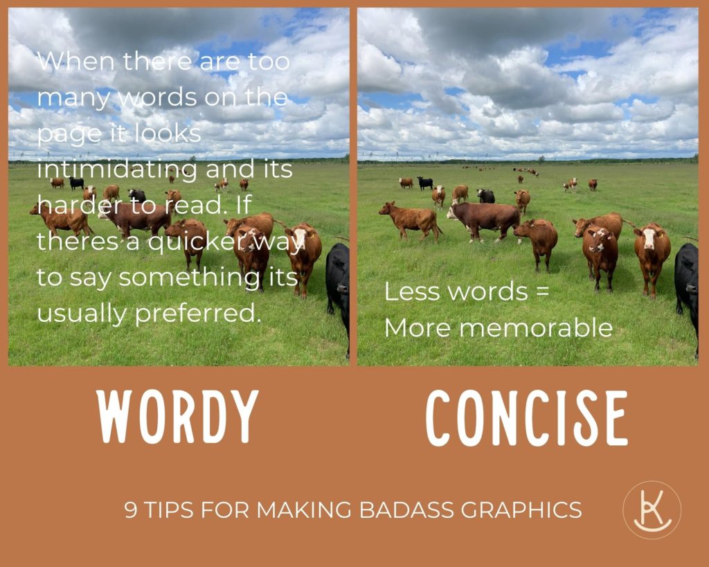
It can be easy to worry that you haven’t explained yourself well and add another sentence. When it comes to graphics… less is more. On the other hand, if your telling a story or writing an article it’s important to share the whole idea but a graphic is meant to peak your interest and give you the most important points. If you want a striking graphic then stick to; one sentence, one thought, one statement. Try to remove as many unnecessary or redundant words as possible. I often ask myself “whats the main point of this?” and then use the first words that come to mind.
Four. PICK A COOL MAIN FONT
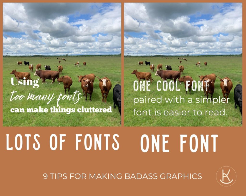
Have you ever gone down a font rabbit hole? Your looking for a certain style and then you find five other really cool fonts and you want to use them ALL in your next graphic. I get it… but have patience. One interesting font per graphic is plenty.
Five. CHOOSE PHOTOS WISELY
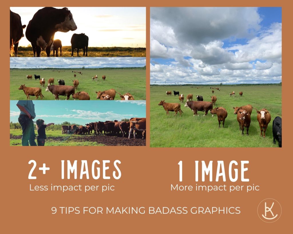
I often see people adding photos on top of other photos. Or multiple photos in one graphic. I think it’s because they want to portray a certain style or feeling or showcase everything they have to offer at once. This usually has the opposite effect though by making the graphic seem cluttered and chaotic. Using one great photo has a lot more impact (and if you must use other photos make sure they are much smaller than the main photo).
Six. LEAVE WHITE SPACE
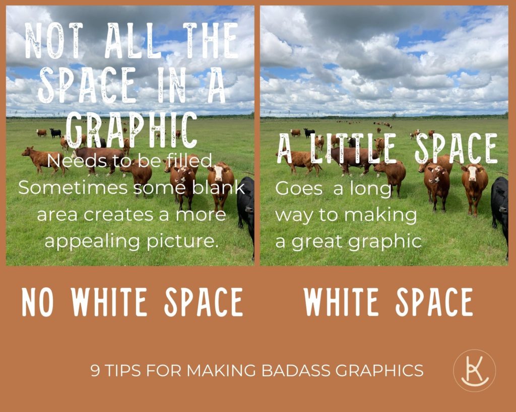
You do not need to fill all the space. I REPEAT. Do not use all the space. Give your graphic room to breath.
Seven. ALIGNMENT MATTERS
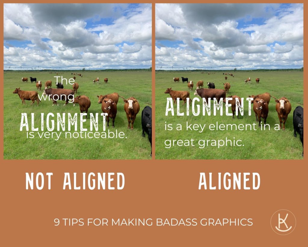
Most editing programs have tools to help you align your text and images. Learning to use them can make your life a lot easier. When necessary, align items to the centre, left or right and make sure the vertical spacing between items is even and the horizontal spacing is even. Canva is an excellent design program.
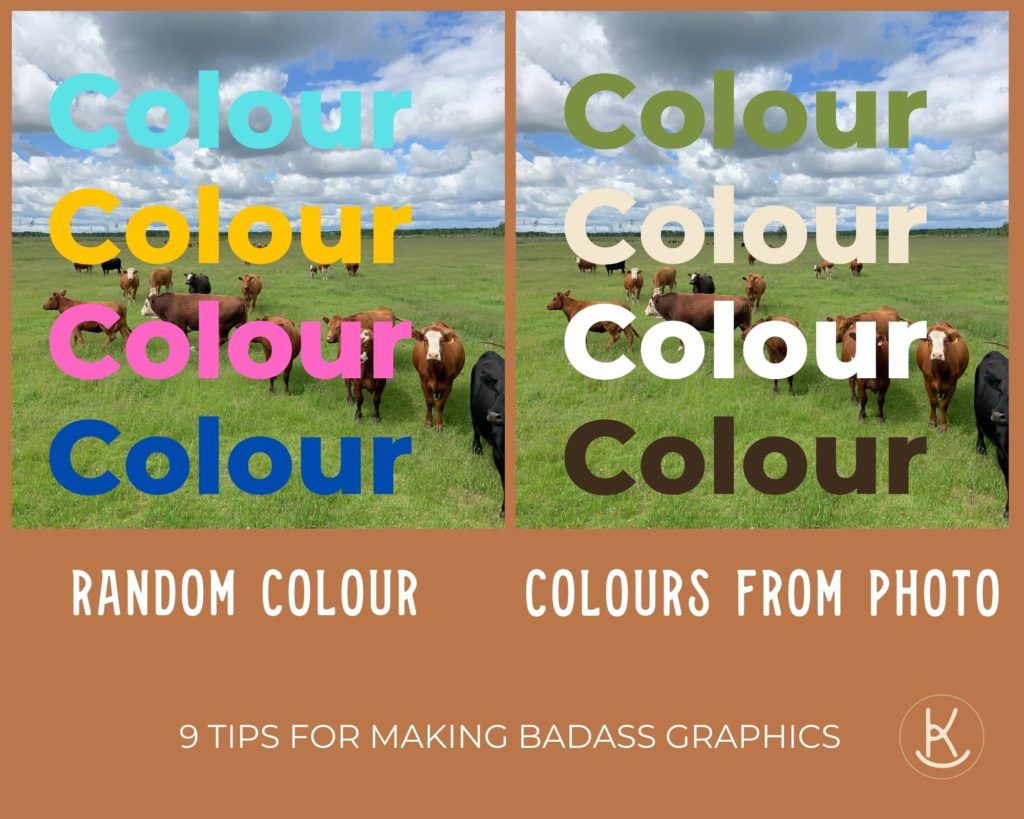
Eight. PICK A SIMPLE COLOUR PALETTE
Playing around with different colours is great fun. If you want a simple way to pick colours that will look amazing then just choose photos from your picture or logo. Alternatively you can choose your colour palette and filter the photo to have one or two of those shades in it. For example, if your palette includes teal you can choose a filter that turns the sky to a teal colour. Just be careful not to over filter your photos. Subtle filters go a long way.
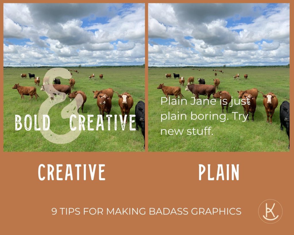
Nine. BE CREATIVE AND BOLD
My last tip is, in my opinion, the most important. Try new things. Be bold. Be creative. Don’t hold back. If you think of a crazy idea try to create it. Don’t let that voice in your head tell you it will “look stupid” before you’ve even tried it. Also, feel free to break any of the above guidelines if you think it will create a new and interesting look. Everyone has different taste and creative flare. And for goodness sakes don’t over think it. Most graphics are gone in the blink of an eye or the 24 hour social media cycle.
People will remember you’r vibe more than anything. What’s yours? Creative? Bold? Classy? Fancy? Blingy? Honest? Western? Own it.
Cheers, Carollyne
Leave a Reply Cancel reply
X
BOKA HOME
Welcome
I'm so glad you're here. Let me throw on my boots and hat and let's get to work!